When John Snow plotted cholera deaths on a map of Soho in 1854, he did something that changed public health forever. By placing disease in space — treating location as data — he identified the Broad Street water pump as the source of an outbreak that had killed hundreds within days. The map did not just describe the epidemic. It diagnosed it.
Modern public health cartography works on a similar principle, applied to the chronic diseases that drive the majority of premature mortality in Europe today. When cardiovascular mortality rates are plotted onto a city map, the patterns that emerge are not random. They are shaped — sharply, consistently, reproducibly — by socioeconomic geography.
What Maps Reveal
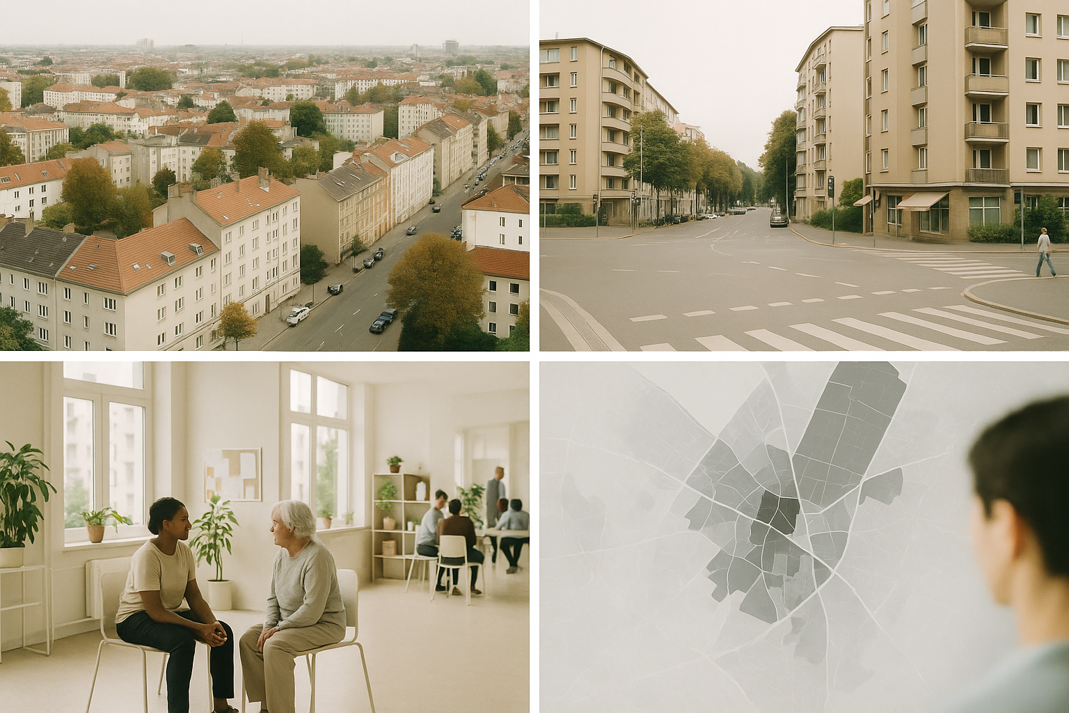
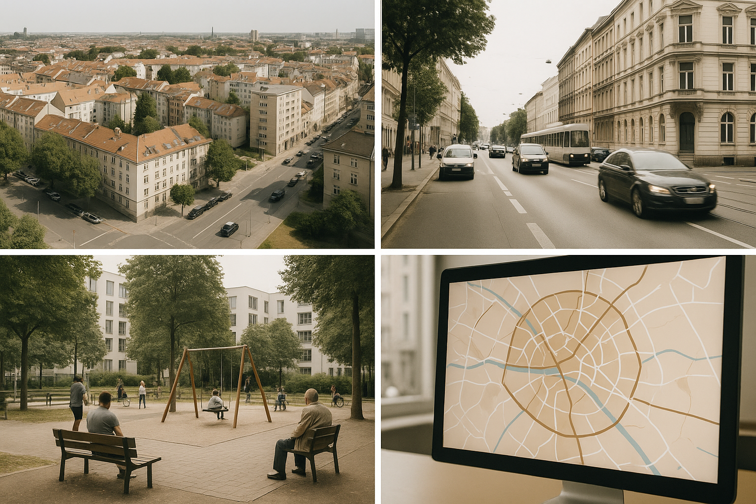
A choropleth map of cardiovascular mortality in Madrid shows very clearly that southern districts — Villaverde, Vallecas, Usera, Carabanchel — have significantly higher age-standardised cardiovascular death rates than the northern and central districts. The pattern is visible at multiple scales: between districts, between census tracts within districts, and between specific blocks within census tracts.
This kind of spatial analysis does more than confirm what epidemiologists already know. It identifies specific areas where cardiovascular burden is most acute, enabling more precisely targeted resource allocation. Edinburgh shows a similar pattern. The former industrial areas of north and west Edinburgh — Granton, Wester Hailes, Niddrie — consistently appear among the highest cardiovascular mortality areas in Scotland, a pattern examined closely in the comparison of cardiovascular inequality across Edinburgh and Madrid, while the wealthier southern suburbs show dramatically better outcomes.
GIS and Spatial Analysis in Epidemiology
Geographic Information Systems (GIS) have become central tools in epidemiological research. GIS platforms allow researchers to layer multiple data types — mortality rates, deprivation indices, environmental exposures, healthcare access, food retail locations, green space coverage — onto a common spatial framework. The result is not just description but analysis: which factors cluster spatially with poor cardiovascular outcomes, and which patterns persist when other variables are controlled.
The HHH Project used GIS to map not only cardiovascular mortality but also neighbourhood-level risk factors: tobacco retail density, access to recreational green space, proximity to fast food outlets, and levels of ambient air pollution. These maps allowed the research team to identify specific environmental features associated with elevated risk, and to compare patterns between Madrid and Edinburgh despite differences in available data between the two countries.
Beyond the Choropleth
Choropleth maps — the familiar colour-coded maps used to show regional variation — are intuitive but have limitations. They display average rates within defined administrative boundaries, which can mask variation within those boundaries and create visual artefacts at boundary edges.
Kernel density estimation produces smoother continuous surfaces that represent the underlying spatial distribution of risk without being constrained by administrative borders. Point pattern analysis can identify whether events — cardiovascular hospitalisations, for instance — cluster spatially at a scale that suggests shared environmental exposure, or are distributed in a way consistent with random variation. These more sophisticated approaches are increasingly used in health equity research to identify environmental “hotspots” where risk factors concentrate.
Cartography as Evidence
There is a communicative power to maps that tables of statistics lack. A map showing that cardiovascular mortality in one Edinburgh postcode is three times that of a postcode two miles away is an argument — a visible, immediate one — for why neighbourhood matters in ways that aggregate national statistics obscure.
Public health cartography is increasingly used as an advocacy tool, not just a research instrument. Local authorities in Spanish cities have begun using GIS-derived health maps to prioritise intervention areas and justify resource allocation decisions to elected bodies. In Edinburgh, the mapping of health inequalities has been central to the city’s Poverty Commission recommendations on housing and neighbourhood investment. Maps do not create political will, and the social forces behind the gradient are explored in depth when looking at the upstream social determinants of heart disease. But they make the invisible visible But they make the invisible visible — and that is often where change begins.